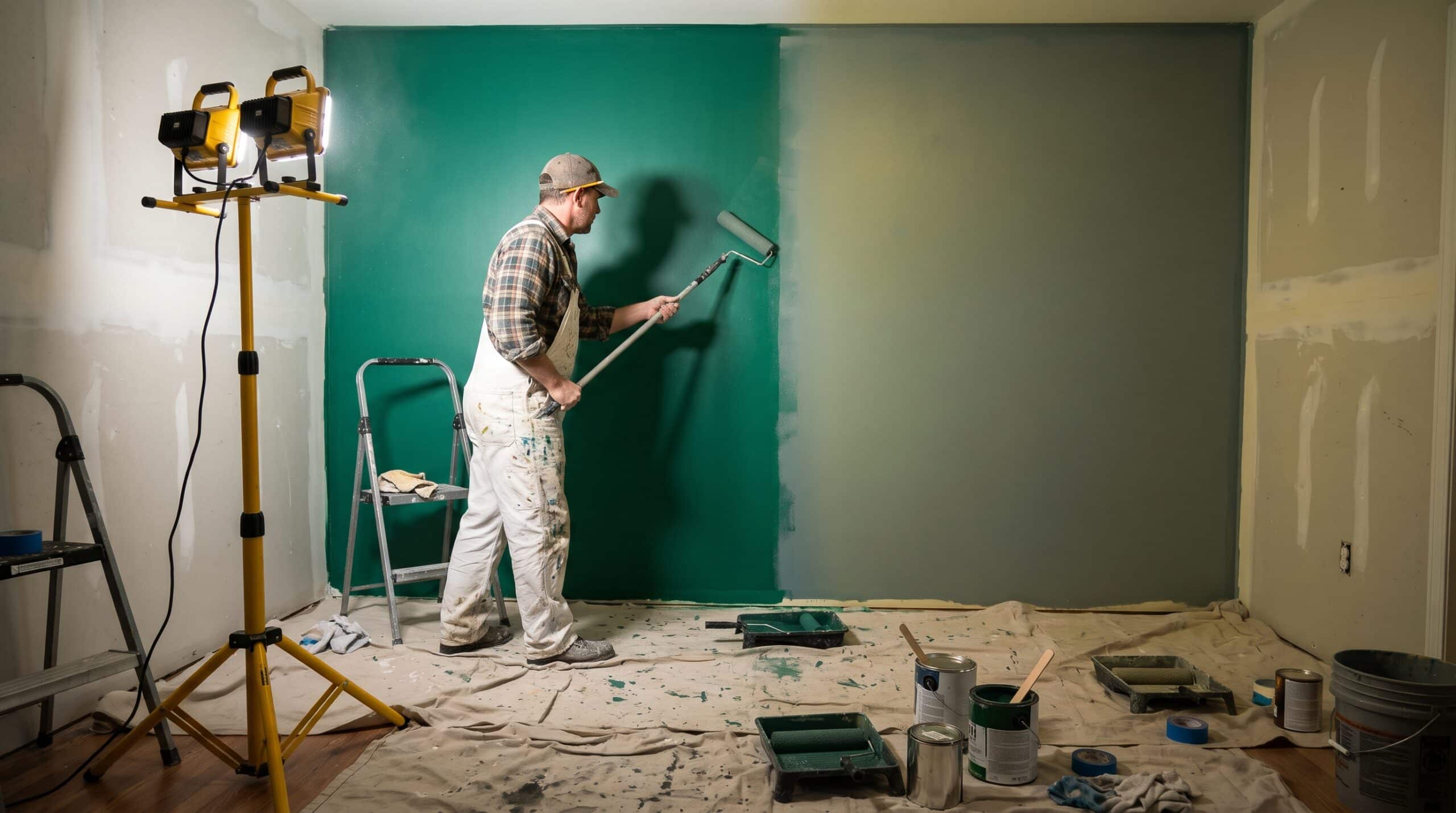
LED Work Lights for Painters: Why CRI and Color Accuracy Matter
I have spent most of my career specifying light for museums, hotel lobbies, retail flagships, and the occasional private residence where the client cared more about the plaster than the furniture. In nearly every one of those projects there was a moment, usually late in construction, when a painting contractor and I stood in front of a wall and disagreed about what color it was. Nine times out of ten, neither of us was wrong. The light was wrong. That is why I take the question of choosing a work light for painters far more seriously than most people expect a lighting designer to.
Painters are asked to make a surface look exactly like a sample, under conditions that rarely match the ones the sample was approved in. The tool they use to judge that match is whatever light is clamped to the ladder. If that light is lying about color, the painter is working blind and does not know it.
This article is my attempt to explain, from the specifier’s side of the table, what color rendering really means, which numbers on a spec sheet deserve your attention, and how to pick and use a work light for painters that tells the truth.
The Wall That Looked Fine at 4 PM
A few years ago I was brought onto a boutique hotel renovation after the corridors had already been painted. The finish was a warm greige, a color that sits right on the line between beige and gray. Over the winter, the painting crew had worked under inexpensive LED flood lights, the kind sold in twin packs at any hardware store. Every wall passed their inspection.
Then the permanent lighting went in. These were high quality downlights with excellent color rendering, the fixtures I had specified for the corridor. Under them, roughly one in every five walls looked slightly green. The owner noticed in a single walk through. The crew had pulled from two different batches of paint, and under their work lights the batches looked identical. Under a full spectrum source, they did not.
Nobody on that crew was careless. Their lights simply could not show them the difference. The repaint cost the contractor several days and a fair amount of goodwill. The fix, had anyone thought about it in advance, would have been a pair of better lights costing less than one day of labor.
I tell this story because it captures the whole problem. Color accuracy on a jobsite is not a luxury for fussy designers. It is quality control, and the work light is the instrument.
What CRI Actually Measures, and What It Quietly Skips
The Color Rendering Index, or CRI, is the number most people have heard of. It compares how a set of reference colors appears under a test light versus under a reference source of the same color temperature, such as daylight or an incandescent style blackbody source. A perfect match scores 100.
The catch is in the details. The general CRI score, written as Ra, is the average of only eight test colors, labeled R1 through R8. Those eight are all soft, desaturated pastels. They say almost nothing about how a light handles strong, saturated color.
There is an extended set of samples, R9 through R15, that includes a saturated red, yellow, green, blue, two skin tones, and a leaf green. Manufacturers are not required to publish these, and most work light brands do not. So when you see “CRI 80” on a package, you are seeing an average of eight pastels and nothing more.
That matters because an average can hide a lot. A light can score well on the pastels while being badly deficient in one part of the spectrum. Two lights with identical CRI numbers can render the same wall very differently.
For context, the ENERGY STAR program sets a minimum CRI of 80 for indoor residential fixtures. That is a reasonable floor for a living room. It is not a reasonable floor for a person whose job is judging color.
R9: The Number Painters Never See on a Work Light Box
If I could get painters to remember one thing from this article, it would be this: ask for the R9 value.
R9 is the saturated red sample. It is not included in the general CRI average, and it is the single most common weak spot in white LEDs. Most white LEDs make light by pumping a blue chip through a yellow phosphor, and the result is often thin in deep red wavelengths. Because R9 is excluded from Ra, a light can post a respectable CRI while rendering reds terribly. R9 can even go negative. Waveform Lighting has documented an LED with a general CRI of 79 and an R9 of roughly minus 1.4, which means saturated reds under that light look worse than gray.
Why should a painter care about red if the job is a white ceiling? Because red is hidden inside far more colors than people realize. Warm whites, creams, terracottas, wood stains, flesh toned plasters, burgundies, and most of the earthy neutrals that dominate residential palettes all carry red content. When a light starves the red end of the spectrum, those colors go flat, muddy, or slightly green. Batch differences in warm neutrals, like the greige in my hotel story, often show up most clearly in the red channel.
In my own specifications, I treat R9 as a separate line item. For general architectural work I want R9 of at least 50. For anything color critical, including any work light for painters used for final inspection, I want R9 above 80. Very few contractor grade products publish that figure, which tells you something on its own.
Beyond CRI: Reading a TM30 Report Like a Specifier
CRI was developed long before LEDs existed, and the lighting industry has known about its limitations for decades. The Illuminating Engineering Society responded with a method called IES TM30. It was first published in 2015, and the current edition is ANSI/IES TM30 in its 2024 revision. On serious architectural projects, I now ask for TM30 data on every luminaire.
Rf, Rg, and the Color Vector Graphic
TM30 does two things CRI cannot. First, it evaluates fidelity using 99 color samples drawn from real world objects instead of eight pastels. That fidelity score is called Rf, and like CRI it tops out at 100. Second, it adds a Gamut Index, Rg, which tells you whether a light makes colors look more saturated or less saturated than the reference. An Rg of 100 means saturation is preserved on average. Above 100, colors look punchier. Below 100, they look duller.
That second number is the one painters should understand, because high saturation can be flattering and still be inaccurate. Many lights designed for retail are tuned to push reds and greens a little beyond reality, because shoppers tend to prefer vivid merchandise. That suits a clothing store. It is a poor choice for a painter, because a light that exaggerates saturation will make a color look richer than it will under the homeowner’s lamps.
TM30 also includes a circular graphic called the color vector graphic, which divides the hue circle into 16 bins and shows, with arrows, which hues a light is pushing outward or pulling inward. If the arrows in the red region point inward, warm colors will look tired. If they point sharply outward everywhere, the light is tuned for drama, not truth.
For a work light for painters, my target is simple: Rf of 90 or higher and Rg close to 100, ideally somewhere between 97 and 104. That combination means the light is both faithful and honest about saturation.
Color Temperature vs Color Accuracy in a Work Light for Painters
Color temperature, measured in kelvins, describes whether white light looks warm and amber (around 2700K) or cool and bluish (5000K and above). By contrast, color rendering describes how accurately that light reveals the colors of objects. They are completely separate properties. A 5000K “daylight” LED can have poor color rendering. A 2700K LED can have excellent color rendering.
That said, color temperature does change how paint looks, so it deserves a deliberate choice. The international standard for visual color evaluation of opaque materials, ASTM D1729, recommends simulated average daylight, the CIE illuminant called D65, which sits around 6500K, as the primary viewing source. It also recommends confirming a match under a second, very different source, because two colors can match under one spectrum and split apart under another.
In practice, the ideal work light for painters is really two kinds of light on a job:
An inspection light at roughly 5000K to 6500K with very high color rendering. This is your neutral judge. It is the closest thing to a portable version of the viewing booth used in paint labs.
A check light that matches the room’s final lighting, usually 2700K or 3000K in homes and 3000K to 4000K in many commercial interiors. This tells you what the client will actually see at night.
If a touchup or batch change disappears under both, you can walk away with confidence. If it vanishes under one and shows under the other, you have caught a problem before the client does.
Metamerism: Why Painters See Touchups Flash Under the Wrong Work Light
The scientific name for the problem in my hotel story is metamerism. Two samples are metameric when they look identical under one light source but different under another. It happens because the human eye reduces an entire spectrum of reflected light down to three cone responses. Very different spectral curves can produce the same three signals, and therefore the same perceived color, until the light changes.
Paint is especially prone to this. Two cans of the “same” color can be built from different pigment combinations, either because they came from different batches, different tinting machines, or a color match done at another store. Under one light they agree. Under another they do not.
A low quality LED makes metamerism worse in a particularly sneaky way. Because its spectrum has peaks and valleys rather than a smooth curve, it can make mismatched samples look identical, hiding the very differences you need to catch. A full spectrum, high fidelity light is far more likely to reveal a mismatch. A better light will sometimes make your job look worse in the moment. That is exactly what you want.
Industrial color labs measure spectral reflectance with spectrophotometers and still confirm matches visually under controlled daylight, precisely because instruments and eyes can disagree. A painter in a client’s living room does not have a spectrophotometer, but they can carry the next best thing: a work light for painters that is genuinely trustworthy.
What I Look for in a Work Light for Painters
When a contractor asks me to recommend a work light for painters, I do not give them a brand name first. I give them a short list of specifications, and I tell them to walk away from any product that will not disclose them.
Color Metrics Painters Should Demand From a Work Light
Color rendering. CRI of 90 at an absolute minimum, 95 or higher preferred. Anything marketed simply as “bright” without a published CRI is not a color tool.
R9. At least 50, ideally 80 or above. If the manufacturer will not tell you, assume it is low.
TM30 data. Rf of 90 or more and Rg near 100. A manufacturer who supplies a TM30 report, even a single page summary, has earned more trust than one who does not.
Color temperature options. Either two lights at different temperatures, or one tunable light that genuinely holds its color rendering across the range. Cheap tunable lights often perform well at one end and poorly at the other, so check the data at each setting you plan to use.
Hardware Qualities That Protect Your Judgment
Low flicker. Many inexpensive LED drivers flicker at a rate you cannot consciously see but your visual system still registers. It causes eye fatigue over a long day. Look for lights described as flicker free, especially at low brightness settings.
Diffusion and glare control. A bare, hot LED array creates harsh specular reflections on satin and semigloss finishes. A good diffuser lens spreads the light evenly and lets you read the surface rather than the glare. Benjamin Moore’s own color guidance notes that higher sheen finishes produce more glare from a light source, which is one more reason the shape of the light matters as much as its spectrum.
Uniform output. ASTM D1729 calls for illuminance that is uniform within plus or minus 20 percent across the viewing area, with no abrupt changes. A light with a hot center and a dim edge will make one section of a wall look different from the next.
Unit to unit consistency. If you buy several of the same light, they should match each other. Lighting designers describe this tightness using MacAdam ellipse steps, often written as SDCM. Three steps or fewer is very good. Mismatched work lights on the same wall can create apparent color shifts that are not in the paint at all.
How to Use a Work Light for Painters on the Job
Owning a good light is half the job. Positioning it is the other half.
Use raking light to find defects. A light placed close to the wall and aimed almost parallel to the surface throws every ridge, roller mark, lap line, and patch into sharp relief. This is a different job from judging color, and it is worth doing as a separate pass. Many callbacks I have seen were texture problems, not color problems.
Use frontal, diffused light to judge color. For color evaluation, move the light back and aim it more directly at the surface, so the wall is evenly lit without glare. Stand where the client will stand.
Do not mix light sources while judging. If a high CRI work light is competing with a bare fluorescent tube, a window, and a phone flashlight, your eye is averaging several spectra at once. Turn off what you can, and judge under one known source at a time.
Watch the surroundings. Light bounces. A bright red drop cloth, a freshly stained floor, or a green tarp outside the window will tint the light reaching the wall. Color labs use neutral gray surrounds for this reason.
Check under the permanent lighting before you leave. If the fixtures are installed, turn them on and walk the space. This is the light the client will live with, and it is the final word.
A Five Minute Field Test for Any Work Light for Painters
You do not need a spectrometer to separate a decent work light for painters from a poor one.
Gather a few physical references: a bright red paint chip, a warm white chip, a skin toned chip, and a deep navy chip next to a black one. A fan deck works well. Turn off every other light source you can.
Hold the chips under your current work light, then under the best daylight you can find, ideally indirect north light through a window on a clear day. Look at four things.
Does the red stay red, or does it drift toward brown or orange? That is your R9 at work.
Does the warm white look creamy and clean, or slightly greenish and dull?
Can you clearly tell the navy from the black? Poor lights collapse dark colors together.
Does the skin toned chip look natural, or waxy and gray?
If your light fails two or more of those checks, it is fine for general visibility and demolition work, but it should not be the light you use to sign off on color.
Where a Cheap Work Light Costs Painters Real Money
I understand the economics. A low cost LED flood is bright, durable, and cheap enough that a crew might own a dozen. Keep them. They are excellent for prep, demolition, and safety.
What I recommend is a two tier approach. Use the inexpensive lights for illumination, and invest in one or two high fidelity lights as your color instruments, treated like a good level or a moisture meter. Batch changes on long walls, touchups on finished work, custom matches, and warm white cabinetry are where color errors get expensive, and a single callback in any of them usually costs more than the light that would have prevented it.
Final Thoughts From the Specifier’s Side
When I specify lighting for a building, I spend weeks on spectral data, mockups, and side by side comparisons, because I know that the final appearance of every surface depends on the light that lands on it. Paint is not a fixed color. It is a reflection of whatever light is present, and changing the light changes the color.
Painters live inside that reality every day, often with tools that hide it from them. A properly chosen work light for painters closes that gap. It lets you see what the client will see, catch what the permanent lighting will reveal, and defend your work with confidence when someone questions it.
Look past the lumen count on the box. Ask for CRI, ask for R9, ask for TM30 if you can get it, and test before you trust. Your eye is the most sophisticated color instrument on the jobsite. Give it light worth working with.
Frequently Asked Questions
What CRI should a work light for painters have?
Aim for a CRI of 90 at minimum, with 95 or higher preferred for final color inspection. Just as important, ask for the R9 value, since general CRI does not include saturated red. Waveform Lighting explains why R9 matters and why many products avoid publishing it.
Is a “daylight” LED the same as a high CRI LED?
No. “Daylight” describes color temperature, meaning the light looks cool and bluish white. It says nothing about how accurately the light renders color. A daylight LED can have poor color rendering. Always check the CRI, R9, and if available, TM30 data. LEDLENSER’s guide to color rendering separates these two properties clearly.
What is TM30, and do painters really need it?
TM30 is the Illuminating Engineering Society’s newer method for evaluating color rendition. It uses 99 real world color samples and reports both fidelity (Rf) and saturation (Rg). Painters do not need to read full reports, but a light with Rf of 90 or more and Rg near 100 is a strong sign of accuracy. The U.S. Department of Energy’s TM30 overview walks through the basics.
Why do my touchups look fine at night but show in the morning?
That is usually metamerism, where two paint samples match under one light but not another. Different batches or tint formulas can share a color under warm artificial light and diverge under daylight. Carboline’s explanation of metamerism shows how coatings labs deal with it.
What color temperature is best for checking paint color?
Use two references if you can: a high CRI light around 5000K to 6500K as a neutral judge, and a second light that matches the room’s permanent lighting. ASTM recommends simulated daylight (D65) for visual color appraisal and confirming matches under a second, different source. See ASTM D1729 for the standard practice.
References
U.S. Department of Energy. Video: TM30 Basics, Solid State Lighting Program
U.S. Department of Energy. What Have We Learned About TM30 in the Past Two Years?
Waveform Lighting. What is CRI R9 and Why is it Important?
LightNOW. Inside the New IES Method for Color Evaluation
Designing Light. TM30 Rg, The Gamut Index
Construction Specifier. Advancing the Quality of Light
Healthcare Facilities Today. LED Lighting Standards: What is R9 and Why Does It Matter?
Carboline. Understanding Metamerism: Color Matching for Industrial Coatings
RMIT Open Press. Metamerism: Colour Perception and Matching
Benjamin Moore. How to Pick the Perfect Paint Colour for the Light in Your Room
LEDLENSER. CRI: An Explanation of the Colour Rendering Index for LED Lighting